Strategies for Using Visuals to Put Breaking Science in Context
By Jen Christiansen / 4 minute read
As I’ve noted, newsworthy scientific discoveries generally stand on a foundation of lots of incremental research findings. Although it’s often tempting to dive right into showing the latest results, a nonspecialist reader may not be primed to understand or appreciate the breakthrough without background information. Here are three strategies for providing your readers with the context they need in order to better understand the latest development.
Strategy 1: Annotate the Primary Source Material Directly, in Plain Language
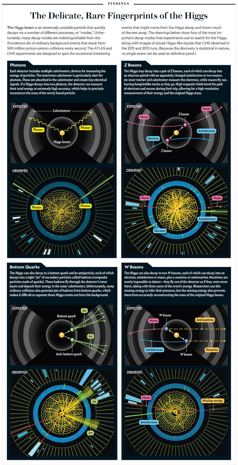
Press releases and academic publications often include key visualizations that highlight the latest development. For example, you may have seen some abstract images related to the Higgs boson that circulated widely in July 2012, when evidence of the previously hypothetical subatomic particle was announced. They depicted oblique and cross-sectional views of a semi-transparent blue cylinder on a black background, with orange lines constrained within the cylinder and a few green lines busting through. Many news outlets ran the pickup images as is. How many people really understood what they were seeing? My guess: not many.
But with a little additional work by a graphics editor, those images could have been annotated with key points to clarify what was being depicted. A few labels can go a long way in helping readers better understand an image’s significance.

The same goes for other figures presented in academic papers. If you choose to pick up an original chart directly, think about how annotations might be able to help a reader focus on the critical takeaways. If you don’t immediately understand the graphic — even if it’s beautiful — your readers won’t either. That’s when annotations can be helpful.
Strategy 2: Fold Background Information Into the Main Graphic
Sometimes a few explanatory annotations aren’t enough, and companion schematics are needed. If you find that it takes paragraphs of text to explain a concept, consider relying on a visual to carry that burden.
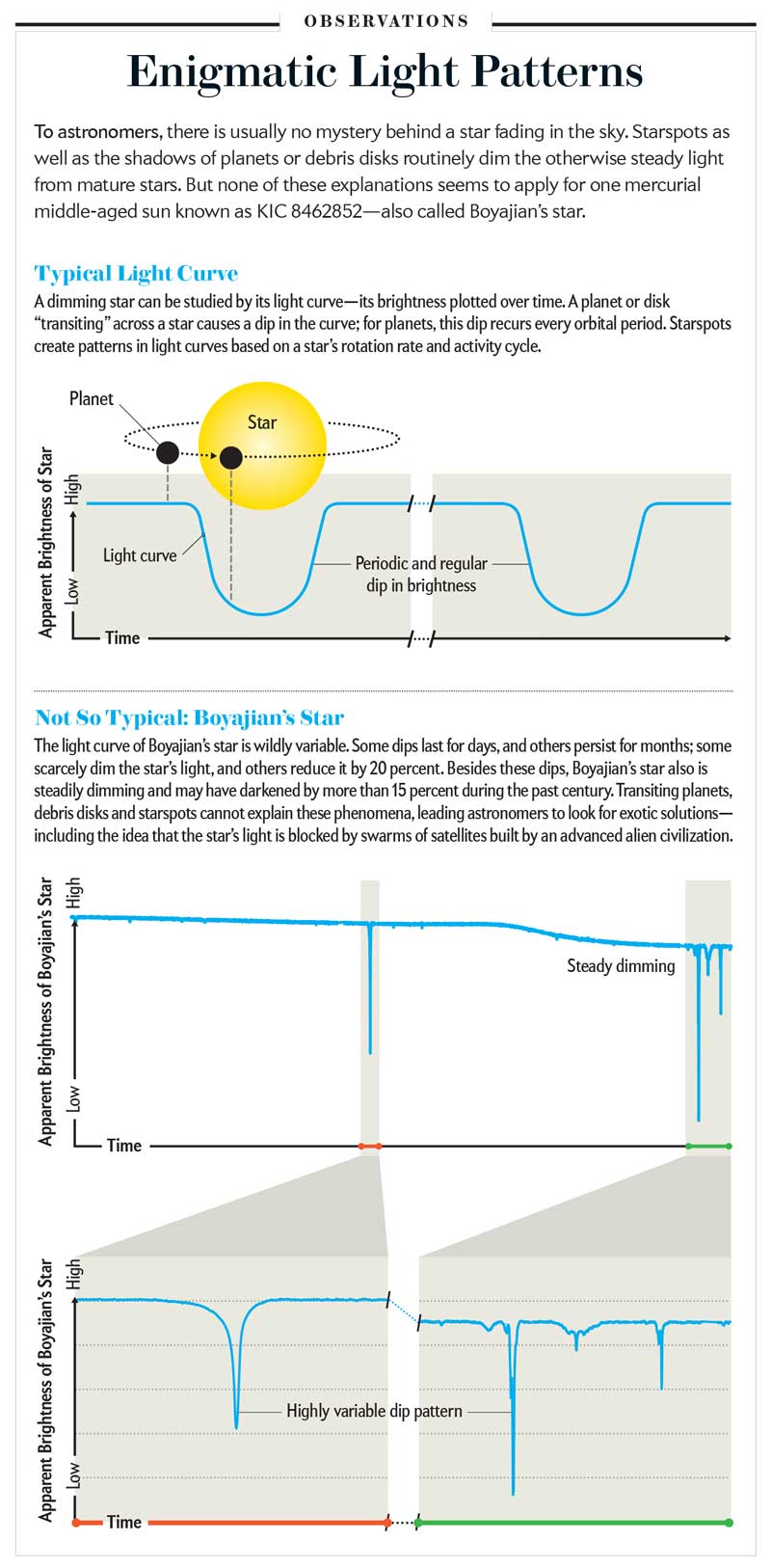
Perhaps you have heard of Boyajian’s star, also known as Tabby’s star, after the astronomer Tabetha Boyajian, who first noted the odd fluctuations in its apparent brightness when viewed from Earth. If you don’t know it by name, you might recall it from the headlines suggesting that the dimming could be the result of alien superstructures in orbit around the star.
For an article in which Kimberly Cartier and Jason T. Wright explored the hypotheses in play, we decided to create a data visualization to tell one piece of the story: Why is the dimming pattern perplexing? Presenting a graph of perceived light intensity from Tabby’s star was a start, but that would only demonstrate the pattern, not explain why it was unusual. To do that, we needed to represent a more common star-dimming situation — a pattern of regular dips caused by a planet passing in front of the star in a fixed orbit. Armed with that information, the reader can then see why the irregular pattern exhibited by Tabby’s star is so odd.

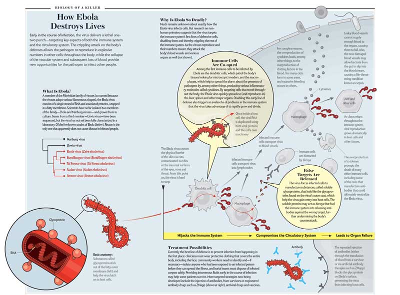
Folding in contextual information can help prevent “information overload” when too much is presented all at once. That was a strategy we used with a diagram I developed for an article by Helen Branswell about the Ebola virus. The goals of the graphic were to show why the Ebola virus is so deadly and to highlight stages of the disease that could be targets for treatment. In this case, I aimed to keep the virus as the focus by having the reader track it across the page as if through time. This timeline became the spine of the composition. Then I introduced human cells and the body’s immune response as they became relevant in the timeline. Then two key concepts — major points in the main text — were highlighted in yellow. Isolating those two points in yellow circles reinforced the hierarchy of information: context as background, critical new details as overlay.

Strategy 3: Include a Primer Box
Torn between the need to provide background material and the desire to get right to it with information on the latest discovery? Consider breaking things down into separate graphics. A primer box can introduce basic concepts to readers who may need more context. Those more familiar with the topic can jump straight to the new stuff. For an article on the 2009 H1N1 flu pandemic, for example, we included a basic graphic showing how and when flu viruses get into human cells and under what circumstances different strains can mix and match genes with one another. Later in the story, we ran a more specific graphic on the specific biology of the 2009 H1N1 flu strain. Thanks to the previous graphic, this one didn’t have to carry the burden of details on basic virus infection and replication.


