Questioning the Data and Accounting for Uncertainty
By Elisabetta Tola / 6 minute read
Numbers are assertions. When you encounter numbers and figures from science papers, institutions, or official reports, you must interrogate them as you would any other assertion. Do not use them as they are, even if you are in a hurry. Be sure to understand them, where they came from, and how they were derived. Have other sources scrutinized the data? What do those sources say? You can’t assume that a figure, just because it is in a scientific paper, is the Truth.
The New York Times science writer Carl Zimmer provides an example of this from the coronavirus pandemic. In April 2020, a team of researchers released a preprint paper in which they asserted that the fatality rate of Covid-19 was far lower than some experts had estimated. Newsworthy, right?
However, upon scrutiny by other statisticians, it became clear that the “newsworthy figures” were essentially the product of a statistical error. Then, the following month, a prominent study on hydroxychloroquine was published in The Lancet. The study claimed that hydroxychloroquine was ineffective and possibly dangerous as a treatment for Covid-19, earning the report rapid international media attention and pushing the World Health Organization to put clinical trials of the drug on hold. A hundred scientists responded by issuing an open letter raising concerns about the quality of the study’s data. When The Guardian tried to obtain specific information on the data used by the study’s authors and pointed out several inconsistencies that appeared in the results, the lead author was unable to vouch for the data’s accuracy and asked The Lancet for a retraction. “This is a shocking example of research misconduct in the middle of a global health emergency,” The Lancet’s editor told The Guardian. (A full recounting of this story is available on a FiveThirtyEight.com podcast.)
No matter that further research ultimately established the ineffectiveness of hydroxychloroquine in treating Covid-19; the screw-up cast doubt on the scientific process and damaged the public’s trust.
Contrary to popular belief, science is far from being a source of certainty. The scientific method is based on doubt and the trial-and-error approach. Data and facts are always defined at a certain limited level of confidence. And even when lots of evidence points in one direction, there should always be space for constructive skepticism. What science contributes to our informed thinking is not numbers, data, and facts written in stone. On the contrary, its contribution is the ability to continuously investigate the world with an open mind.
One of the most important lessons to learn about the use of data in a story is to embrace uncertainty. “What many people overlook,” says Heather Krauss, founder of Datassist, a company that supports journalists and nonprofits in working with data, “is that to tell a data story accurately, you must provide context. And that includes uncertainty.”
Measuring Confidence
Scientists use several tools to measure and account for uncertainty: p-values, confidence levels, confidence intervals, and margins of error.
The p-value is a concept that even experts can find difficult to express in plain language. In fact, in 2015, Christie Aschwanden, FiveThirtyEight’s lead writer for science asked dozens of scientists to explain it as plainly as possible. The result is both humorous and enlightening; while there is a clear technical definition, explaining it in layman’s terms is a significant challenge. Nevertheless, it’s worth trying, as the p-value is such a commonly accepted measure of significance.
Here is our attempt: You can think of the p-value as a number that allows us to know how confident and reliable — how significant, in statistical terms — a scientific result is. To be more specific: if your hypothesis is not true, how likely is it that you would get a result that is consistent with your hypothesis? The less likely that is, the better — in terms of demonstrating that your result is statistically meaningful.
As an example, let’s look at drug testing to find a treatment for Covid-19. Researchers start with an initial hypothesis (in this case, that the drug being tested is effective), but to test it, they need to be able to reject what’s known as the null hypothesis. In this case, the null hypothesis is that there is no difference between taking the drug or not.
Through a randomly controlled trial of two groups of patients, the researchers compare the outcomes of patients who took the drug with those who didn’t. From these data, the p-value is calculated.
If the p-value is high, it means there’s a high probability that you could get a result showing the drug is effective, even if it isn’t. Conversely, if the p-value is low, then there’s a low probability you’d get a good result for the drug if it wasn’t effective. The p-value is always a figure between 0 and 1, and, conventionally, scientists deem that if the p-value is under 0.05, the results are valid; otherwise they are not.
However, some argue that p-values are improperly relied upon as a be-all, end-all measure of certainty — after all, the p-value is just one data point that can be used to ascertain confidence. Most important, as a Stanford study emphasizes, a p-value does not tell you whether something is true.
In addition to the p-value, science papers often provide other indicators of uncertainty: margins of error and confidence intervals. Results are typically written +/- a margin of error within a defined confidence level (typically, 95% or 99%). Also used in political polling, margins of error and confidence intervals are a way of conveying how confident a researcher is that a range of values is accurate.

For instance, a 2016 research paper from the U.S. Centers for Disease Control and Prevention on neonatal health estimates that, from 2010 to 2017, 83.8% of infants born in the U.S. were ever breastfed. The figure came with a margin of error of +/-1.2, with a 95% confidence interval. The researchers were saying that if the study were reproduced 100 times, at least 95 of the studies would report a figure between 82.6% and 85%.
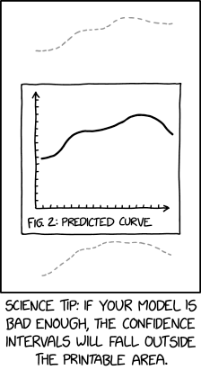
What’s critical to understand — and is the subject of the next section — is that margins of error and confidence intervals are largely based on the size of the group being studied. This is important to keep in mind, since there are many cases when there is a scarcity of data — domestic violence, hate crimes, and racial injustice, for example — or when we deal with infrequent occurrences, such as rare genetic diseases. At those times, statistical models can fall short. That’s when it becomes even more important to add relevant context and perspective, filling the gaps with the help of experts.
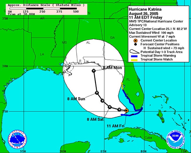
Uncertainty also comes into play in other ways. In 2019, the journalist and visual designer Alberto Cairo looked at how uncertainty is communicated in the field of hurricane forecasting. In collaboration with the National Hurricane Center, he investigated how most people interpret hurricane-forecast maps that indicate landfall probability. The result: they don’t interpret them very well.
Traditionally, forecasters use a “hurricane cone” map to indicate where a hurricane might land. But as Cairo discovered, people don’t really understand the maps and may fail to take appropriate action because of that misunderstanding. The reason, Cairo learned, is that readers misunderstand the maps in a variety of ways, including how uncertainty is represented.
The cone is a range of possible paths with the “central line” indicating the likely center of the storm in the future. In reality, only 60-70% of the time does the center of the hurricane end up within the projected cone. Moreover, the extent of the storm’s reach and devastating impact is far greater than either the cone or the central line indicates. The average person’s ignorance of how to interpret personal risk from a hurricane cone map carries the potential for fatal outcomes. Hurricane landfall forecasting is an excellent example of why one must always ask, when writing about or graphically showing what is likely or probable: Are we accurately conveying uncertainty?

Cairo suggests using alternative maps, like an impact “heat map,” that better demonstrate the true risk. In other cases, writers may need to better describe how significant the uncertainty is and what that actually looks like. A good example of this concept can be found in a Scientific American post regarding statistical significance vis-à-vis the Higgs boson, an elementary particle in physics. While dedicated to the very idea of uncertainty, the post is able to express in layman’s terms some complicated math:
As a concrete example, there is just under a one percent chance of flipping an ordinary coin 100 times and getting at least 66 heads. But if a thousand people flip identical coins 100 times each, it becomes likely that a few people will get at least 66 heads each; one of those events on its own should not be interpreted as evidence that the coins were somehow rigged.
Relying solely on numbers to do the work for you will fail you and your readers. The key is to explain the underlying concepts.


