Uncertainty and Misinformation
By Jen Christiansen / 4 minute read
Two topics are of particular importance in editing and visualizing science stories: showing uncertainty and avoiding misinformation.
Visualizing Uncertainty
Uncertainty is a critical concept as it relates to stories like climate change and global pandemics. Yet I think it’s fair to say that until recently, visual journalists — including myself — too often swept the notion of uncertainty under a rug. How many of us have chosen to ignore confidence intervals when preparing a chart for publication? And when we do represent aspects of uncertainty, how many of us have defaulted to ubiquitous graphical solutions — like the hurricane-projection cone described in one of the chapters on statistics — without further thought, failing to question its efficacy?
And yet, as Barauch Fischhoff and Alex L. Davis write, “All science has uncertainty. Unless that uncertainty is communicated effectively, decision makers may put too much or too little faith in it.”
In 2015, a conversation with the geographer Diana Sinton at the Gordon Research Conference for visualization in science and education caused me to step back and more critically think about how I depict uncertainty. We kicked off a collaboration (with support by a minigrant from NASA) in the hopes of adding another perspective to the broader conversation on visualizing uncertainty. As Sinton and I wrote for a poster session at that conference a few years later:
Scientific illustrations, diagrams, and charts show what is known — and, sometimes, how it is known. Not surprisingly, little attention is paid to representing what is not known. Perhaps more importantly, the categories of “known” and “unknown” are not as binary as the words suggest.... Within the practice of science, the extent to which something is known is a function of what question was asked and how it was answered…. Ambiguous or unclear answers may be just as common as definitive results at the conclusion of an experiment. So the question becomes, How can we provide lay audiences with jargon-free tools with which to interpret critical scientific findings?
I’m afraid that I don’t have clean solutions to every aspect of this challenge, although I include some resources and examples of effective approaches in the “Additional Reading” section. The key, to my mind, is to be aware — and critical — of the uncertainties that exist within the data set that you’re visualizing or the process that you’re illustrating. In practice, I’ve started by embracing uncertainty as an element to be addressed head-on.
For example, in an article on maternal mortality, the article team — the author, Monica McLemore; the text editor, Jen Schwartz; the data designer, Valentina D’Efilippo; the graphics editor, Amanda Montañez; and me — opted to show conflicting statistics from two sources (the World Health Organization and the Institute for Health Metrics and Evaluation). The very act of presenting very different estimates from different agencies underscored the uncertain nature of the measurement. Had we simply whittled things down to a single source, we would’ve lost an opportunity to present the reader with a clear and direct representation of the fact that powerful health organizations have not developed a reliable and consistent way to measure and track maternal-mortality statistics across space and time.
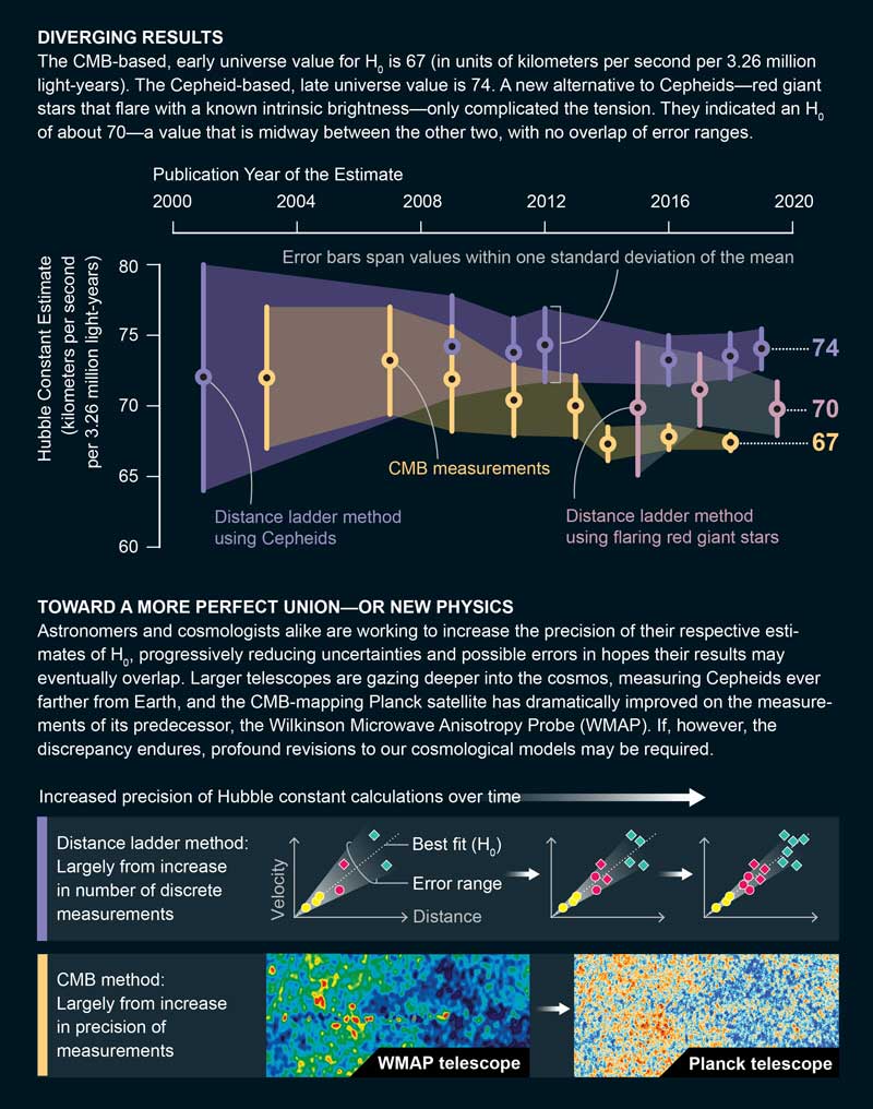
Likewise, for an article on calculating the expansion rate of the cosmos, the author, Richard Panek, wrote about two different measuring techniques. Initial calculations included large, overlapping error bars: It was presumed that the different measuring techniques would eventually arrive at the same answer. But over time, as the error bars shrank, it became clear that the data were diverging. Like many other news outlets covering the same topic, we opted to include a chart plotting the measurements over time for each method, including error bars. But in order to help our readers more fully understand why the error bars changed in size over time, I also included an explanatory diagram on precision.
For one method, the error-bar reduction was due largely to an increase in the number of discrete measurements. For the other method, it was due largely to an increase in the resolution of each discrete measurement, thanks to more-powerful telescopes. A visual explainer allowed us to acknowledge why uncertainty exists in projects of this nature, and some of the ways in which uncertainty can be reduced over time.

Avoiding Misinformation Pitfalls
Because nuance and explanation are easily stripped away from visuals, it is all too easy for people acting in bad faith to share misleading elements. My default position is to simply not honor misinformation with a graphic. It’s simply too easy for folks to remove the graphic from the context of the article or caption and disseminate it through social media. Nevertheless, gray areas exist, particularly when a graphic was created in good faith but, as a result of unintentional mistakes or revised data, proves to be erroneous.
My goal is to make it as hard as possible for someone to isolate and amplify what we know to be incorrect.
Occasionally I find that representing the old (mistaken) and new (corrected) views side-by-side can help readers understand how the errors led to a faulty analysis, and why the newer interpretation is more solid. But in cases like this, I move forward with an eye to how the graphic could be used by folks with ill intent. My goal is to make it as hard as possible for someone to isolate and amplify what we know to be incorrect. For example, for an article by Melinda Moyer on guns and public health, we wanted to address some oft-cited gun-control studies directly. Subsequent analysis revealed serious errors in some classic papers that are often referenced by the pro-gun lobby: The data actually show that more firearms do not keep people safe.
Rather than brush aside the earlier studies that implied otherwise, we decided to go ahead and show the original analysis with a critique baked into the visual presentation. Annotations addressed the statistical errors that influenced the initial interpretations, along with companion charts on the same topic with updated information. The annotations were placed in bold inset circles that were dropped directly onto the charts, making it a bit more difficult to crop and share out of context.


