- Introduction
- How Science Works
- Sources and Experts: Where to Find Them and How to Vet Them
- Making Sense of Science Stats
- Editing for Story
- Editing Controversial Science
- Holding Science to Account
- Covering Health Care
- Climate and the Environment
- Fact-Checking Science Journalism: How to Make Sure Your Stories Are True
-
Illustrating Complex Science Stories
- Introduction
- The Role of Visuals in Science Journalism
- The Process of Building Science-Centric Graphics
- Strategies for Using Visuals to Put Breaking Science in Context
- Special Considerations for Data Visualization
- Uncertainty and Misinformation
- Editorial Illustration, Photography, and Moving Images
- Additional Reading and Resources
- About the Author
- Social Media and Reader Engagement
- Popular Science
- Misinformation
- Op-Eds and Essays
- About This Handbook
Introduction
By Elisabetta Tola / 2 minute read
For many people, numbers convey a sense of specificity, precision, and objectivity. But numbers are merely one description of facts — one interpretation of phenomena. They are a means to compare things, to see patterns, and to evaluate risks. They are not “truth.”
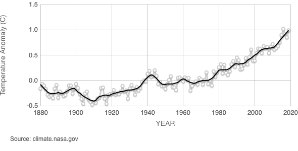
Consider the following: climate change deniers point to the average global temperature recorded in 1998 — 58.3° Fahrenheit — and compare it with that of more recent years, pointing out a decrease in average temperatures for more than a decade that followed. After all, in 2012, the average temperature was lower, at 58.2° Fahrenheit. This, they claim, is proof that global warming isn’t real.
The numbers are true, but the conclusions are deeply flawed. The year 1998 was unusually hot because of a surprisingly strong El Niño. But when the data are considered as a trend, the reality of climate change is incontrovertible.

This cherry-picking of convenient figures is just one example of how scientific data can be misinterpreted. Other ways include:
- when figures are provided without context
- when references to margins of error, methodologies, sample sizes, or compositions are missing
- when correlation and causation are conflated
- when conclusions are drawn from insufficient data
How can you avoid falling into these traps? It is important that as an editor, you approach them with the same sort of skepticism and care that you take with words. What do statistics say and not say? What figures are truly relevant to the story you are telling? Which ones mean something to your readers?
The key, of course, is to understand what a given number or statistic means. Take the statistical concept of “risk.” There are about 95 fatal car accidents a day in the United States. To put it another way, for all practical purposes there is a 100-percent chance of dozens of fatal car crashes in the United States today. But what risk is there to you when you get behind the wheel? How nervous should you be? Not very. Your individual risk of dying in a car crash is less than 1 in 4,000 in any given year.
It is incumbent upon you, the editor, to ensure that numbers and statistics are properly framed and contextualized to honestly represent reality, and that your readers properly understand them.


